The 60-30-10 Color Rule for Living Rooms That Actually Work
Dominant, secondary, accent — the ratio sounds simple until you stand in the paint aisle with fifty swatches. Here is how to apply 60-30-10 to real furniture you already own, not a showroom that nobody lives in.
The Rule Is a Starting Point, Not a Law
Interior designers talk about 60-30-10 the way cooks talk about salt — a useful default you adjust once you taste the room. Sixty percent dominant color, thirty percent secondary, ten percent accent. Walls, large furniture, and floor usually carry the sixty. Curtains, a second sofa, or built-ins might hold the thirty. Pillows, art, lamps, and one throw carry the ten.
What the formula does not tell you is that dominant does not mean boring. It means your eye rests somewhere. A warm white room with oak floors can be the sixty while a deep green sofa holds thirty and terracotta lamps hold ten — the room reads calm, not empty.
I use this rule most often with clients who already own a gray sectional they are tired of looking at but cannot replace this year. We are not starting from a blank catalog page. We are balancing what is stuck until next tax refund.
Map Your Room Before You Buy Paint
Stand in the doorway you use most. What covers the most surface area?
| Surface | Usually Counts As | Typical Share |
|---|---|---|
| Walls and ceiling | Dominant (60) | Largest visual plane |
| Floor (rug or wood tone) | Dominant or secondary | Depends on contrast |
| Main sofa or sectional | Secondary (30) | Big color block at seated height |
| Curtains, second chair, large rug pattern | Secondary | Competes with sofa if both shout |
| Pillows, art, vases, lamp bases | Accent (10) | Small but high saturation |
Take a phone photo and squint. Whatever blur into one blob is probably your dominant mass. If sofa and rug fight for attention, you have two secondaries and no calm base.
Our color palette generator builds five coordinated swatches from a single anchor color — useful when you know the sofa fabric but not the wall shade. Generate a palette, then assign the lightest neutral to walls, mid-tone to textiles, boldest to accents.
Three Living Room Schemes That Hold Up
These use paint names as reference points — always test 8×10 swatches on your actual wall.
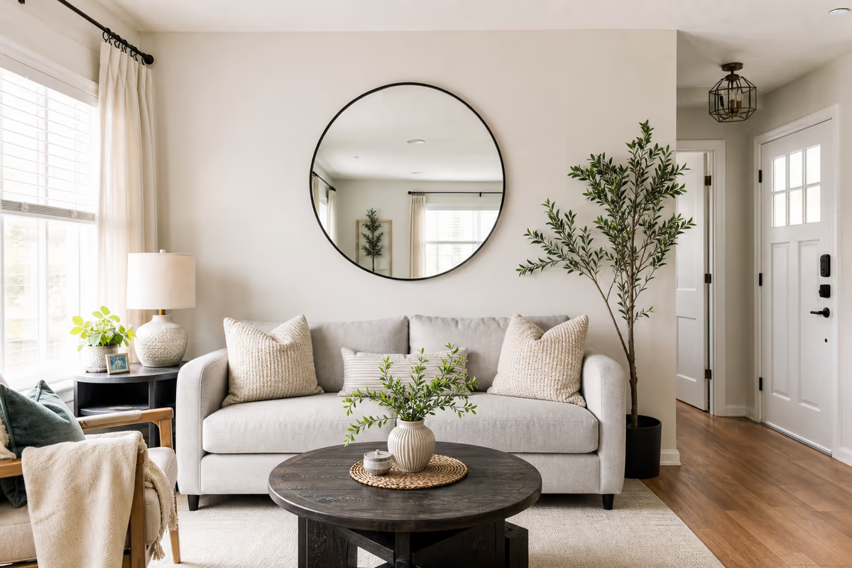
Warm Neutral Base (safe for resell)
- 60%: Sherwin-Williams Alabaster or Benjamin Moore White Dove on walls; light oak or jute rug
- 30%: Linen or oatmeal sofa; ivory curtains with texture
- 10%: Black metal floor lamp, one cognac leather pillow, framed line drawing
Works in small living rooms because light walls bounce daylight. Accent stays graphic, not rainbow.
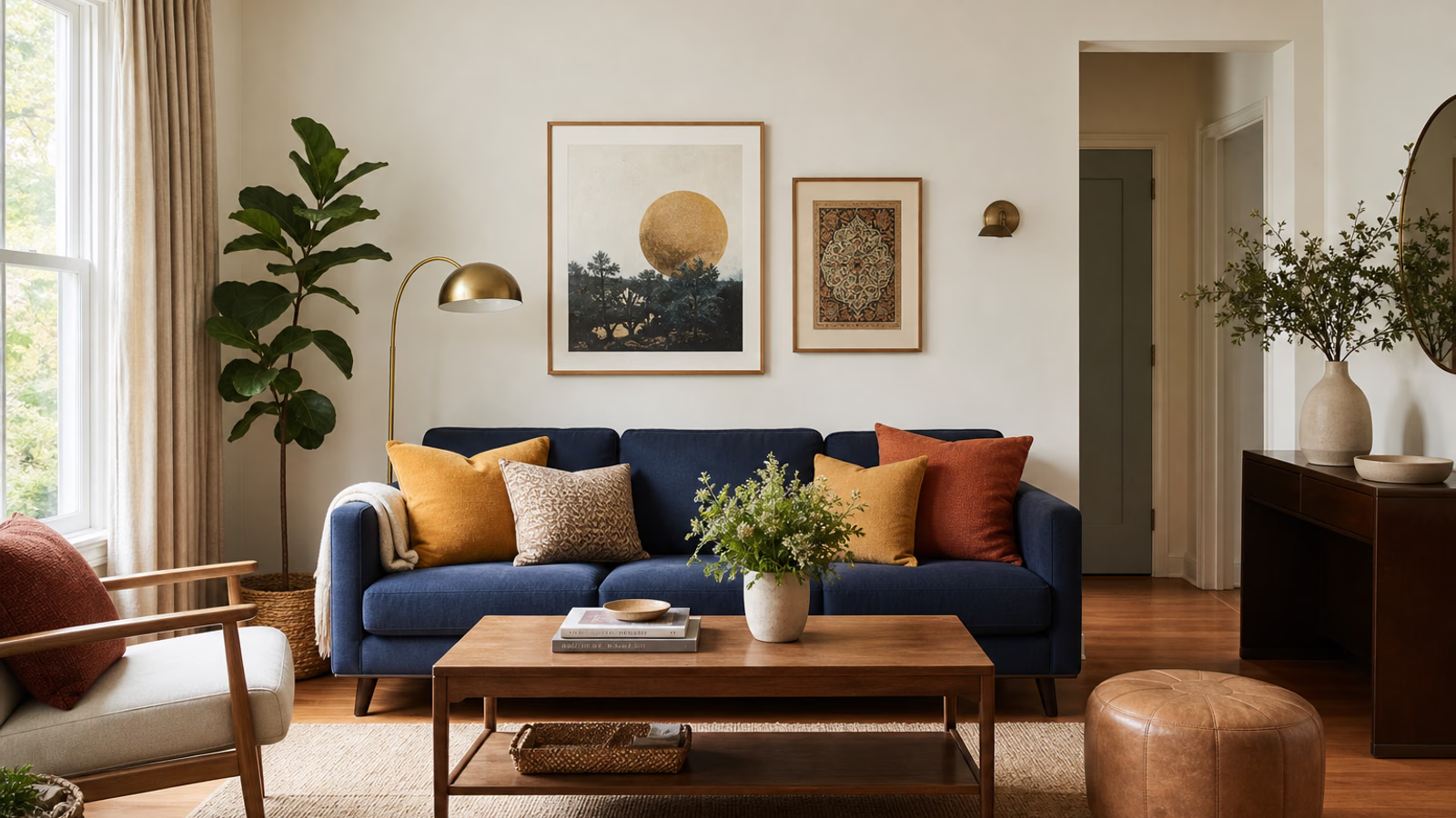
Navy and Clay (more personality, still livable)
- 60%: Soft greige walls (BM Revere Pewter); medium wood floor
- 30%: Navy sofa or slipcover; clay-toned curtains
- 10%: Mustard or rust pillows; brass reading lamp
Navy reads as neutral when walls stay warm. The ten percent is where warmth enters — without rust or mustard, navy plus greige can feel cold.
Green Anchor (biophilic without going full jungle)
- 60%: Warm white walls; natural fiber rug
- 30%: Forest or sage sofa; green-gray curtains
- 10%: Terracotta pot, cream throw, one botanical print
Repeat the accent color at least twice — pot and one pillow — or it looks accidental.
Where People Break the Ratio (On Purpose)
Open-plan homes blur room edges. Your living "sixty" might include kitchen cabinets visible from the couch. That is fine — treat the whole sightline as one palette.
Wood tones count. A dark walnut coffee table is not invisible. If floors are walnut and the table matches, you already have secondary weight. Paint walls lighter to compensate.
Pattern counts as color. A striped rug with navy, cream, and rust is carrying all three roles. Build solids around it instead of adding competing prints.
TV screens are black rectangles. Mount on a wall close to your dominant color so the rectangle does not become the accidental accent.
Step-by-Weekend Application Plan
Friday night: Clear one wall. Tape up three wall swatches from the same family — not three completely different moods. Live with them 24 hours.
Saturday: Assess sofa and rug. If the sofa must stay, it picks the secondary slot. Choose wall color that supports it, not fights it. Use the paint calculator to buy enough for two coats — running out mid-wall guarantees a visible lap mark.
Sunday: Swap pillow covers, add one accent object per seating zone (lamp, bowl, art). Remove one item that introduced a fourth color you never meant to keep — the rogue red basket from a old scheme.
Stop when the squint test passes: one calm background, one clear furniture color, one spark.
Accent Color Mistakes
- Too many accents — five pillow colors is not 10%; it is chaos
- Accent only on one side of the room — balance left and right, or put accent color overhead (lamp) and underfoot (small ottoman)
- Matching everything — the thirty and sixty should relate, not clone. Same beige on walls and sofa disappears
- Ignoring fixed finishes — fireplace brick, honey oak trim, and rental beige carpet are already in the palette. Paint cannot erase orange wood — work with warmer dominants instead
Tie-Ins Without Repainting Everything
Renters and budget refreshes can shift the ratio with textiles:
- Slipcover → changes secondary in an afternoon
- Large rug → covers dominant floor tone
- Curtains floor to ceiling → add thirty percent vertical color; our curtain calculator sizes panels with proper fullness so they stack back cleanly
- Removable wallpaper on one wall → shifts dominant without touching the rest; measure rolls with the wallpaper calculator if you pick a pattern with repeat
When to Ignore 60-30-10
Monochrome rooms — all cream, all gray — can be stunning with texture doing the work. High-contrast rooms (black walls, white trim, one red chair) throw the math out on purpose.
Use the rule when a room feels busy but not intentional. If you already love every piece separately and hate the room together, the ratio usually reveals an missing dominant or a secondary fighting the sofa.
Color is not about matching a magazine. It is about walking in and feeling the furniture, walls, and small objects agreed to be in the same conversation. Sixty thirty ten is just a way to start that conversation without buying all new everything.
Topics covered
- color scheme
- living room
- interior design
- paint colors
Frequently Asked Questions
What is the 60-30-10 color rule in interior design?
Use roughly 60% dominant color (walls, large surfaces), 30% secondary (sofa, curtains, rug), and 10% accent (pillows, art, lamps). It is a starting ratio, not a strict law.
What color should walls be if my sofa is navy?
Choose a warm neutral for the 60% — soft greige, warm white, or light clay. Navy reads as a secondary anchor. Add warm accents like mustard, rust, or brass so the room does not feel cold.
Does the 60-30-10 rule include wood floors and trim?
Yes. Fixed wood tones count toward your palette. Dark walnut floors and trim add secondary weight — balance with lighter walls rather than adding another competing color block.